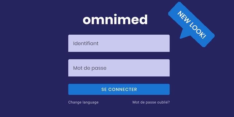
Omnimed is modernizing its corporate image and translating it into all of its activities and platforms, including in its electronic medical record (EMR). The new visual is more sober and modern in order to offer you an improved experience.
The main purpose of the changes is to improve readability and clarity in the application. Among these, note the darker blue which allows more pronounced contrasts as well as the new more defined typography. You will also notice some layout improvements to make navigation smoother and more flexible. The new technological structure behind these changes aims to make the application more intuitive and visually uniform. Other initiatives will follow, according to the comments collected, to improve the ergonomics, usability, and accessibility of your work tool.
Concretely, what the new image brings as a change in the EMR:
- The information from Québec Health Record (QHR) can be found in the summary on the right of the patient record to free up space and remain visible at all times;
- The summary is fixed in the patient record and scrolls independently from the rest of the information for a more comprehensive view of the record;
- The names of the modules on the left are simplified:
- Latest news = News
- Results review = Results
- Tasks review = Tasks
- Notes review = Pending notes
- Resources directory = Directory
- The navigation is more fluid in the record, and the colors, as well as the typography, are more contrasted and clear.
What is next:
The new branding and the launch of the patient portal have led us to improve the aforementioned visual elements, but we would like to mention that several other improvements are to come, among others:
- Redesign of the patient record header
- Navigation in the clinical note and its content
- A request module
- Redesign of the scanning module
On the way to the patient portal!
The change of image is orchestrated with the launch of the first patient portal functionalities, including the sending of clinical tools by email which has been available since this morning. Also, note that a new report is available that allows you to quickly see the transmissions made by fax and email for your institution and the status of each transmission. Please refer to this article for more information.
Our ultimate goal is to create a strong and confident image that the population can associate with their health record via the portal. Our delivery pipeline for the next few months is full of improvements to facilitate interactions with your patients:
- Secure sending of documents by email to the patient (now available!)
- Adding patient photos to the record
- Appointment confirmation by email and SMS directly by Omnimed
- Online appointment request
- Communication to the patient in connection with his laboratory results
The patient portal is the result of your constructive requests: your ideas will continue to support the evolution of the platform in line with the needs of patients. The trend continues towards empowerment, shared decision-making, and collaboration.
✴️ Please feel free to write us your comments on Omnimed's new look in the chat! We are excited to continue our work with you and to see grow our new features and the patient portal alongside you.